
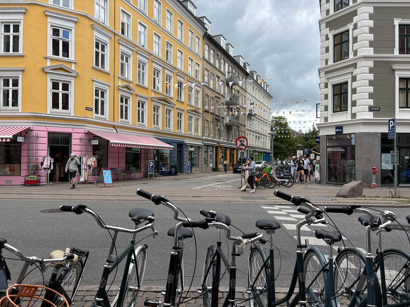
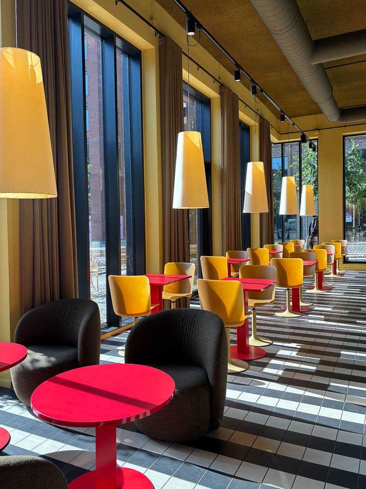
Anyone who’s been to Ikea could pick up on the main tenets of Scandinavian design. Clean lines, lots of natural light, neutrals mixed with pops of bold color. A comforting sense of order.
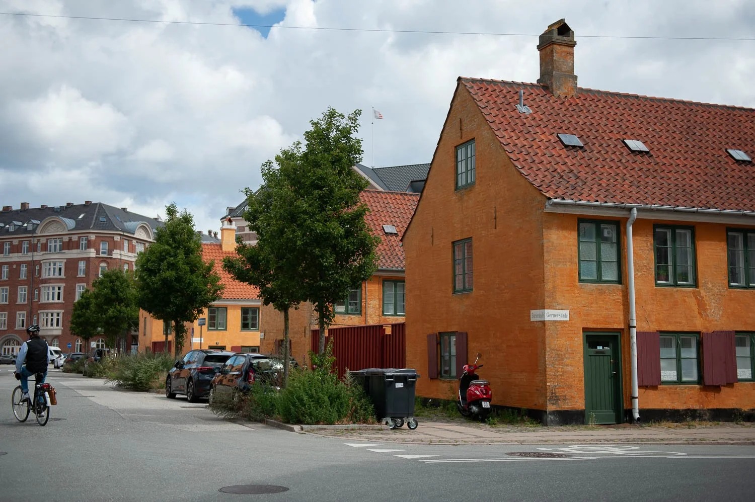
Being there in person, I noticed all that and more.
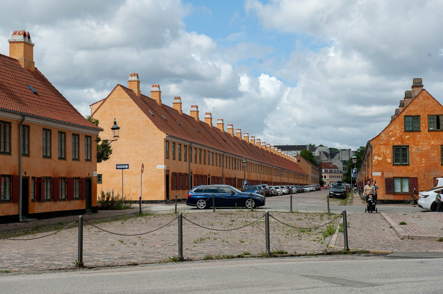
What I liked about Copenhagen is that everything felt considered, but not precious.
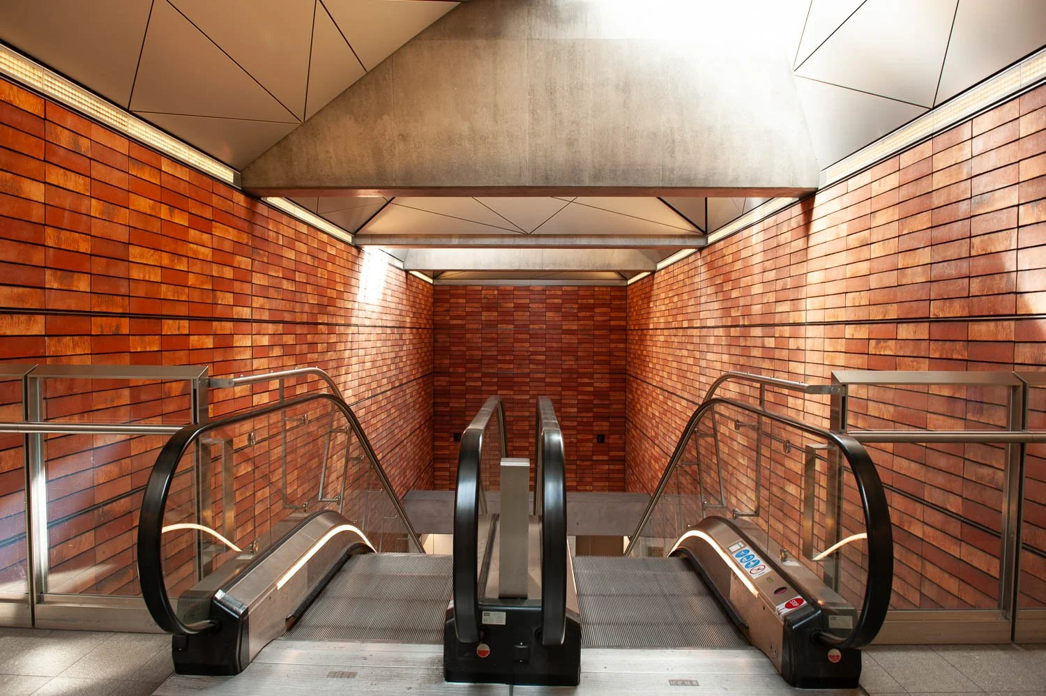
Public spaces were well appointed.
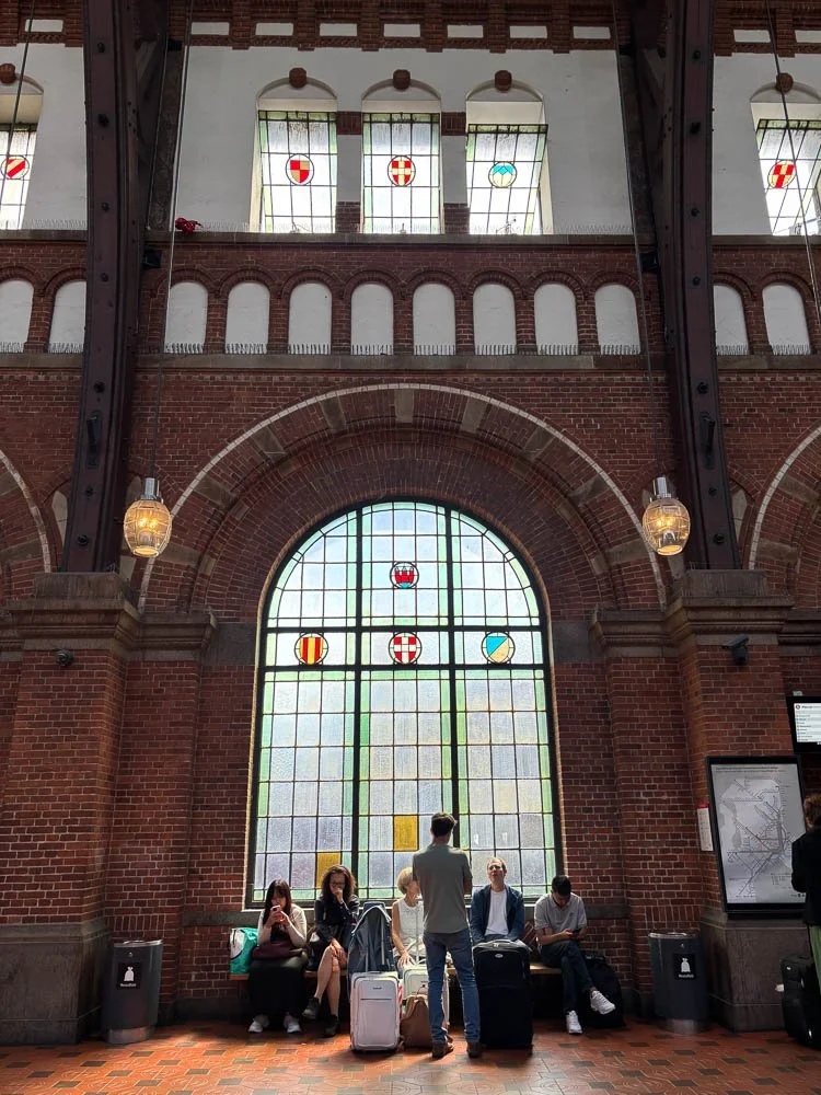
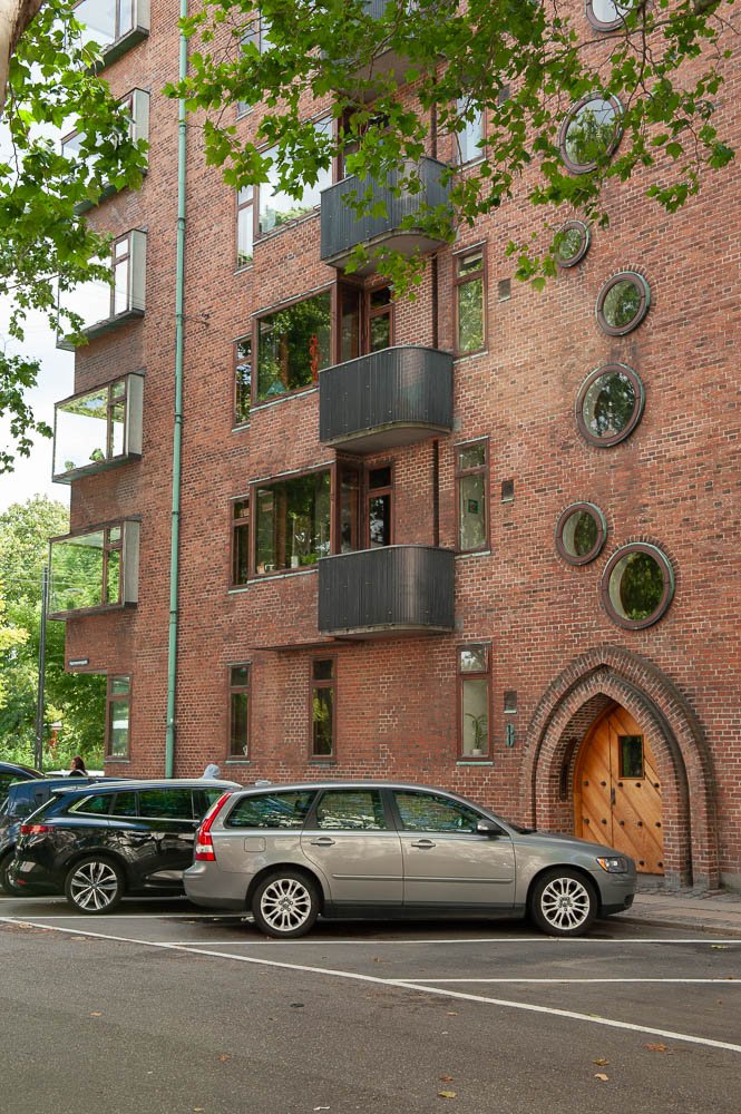
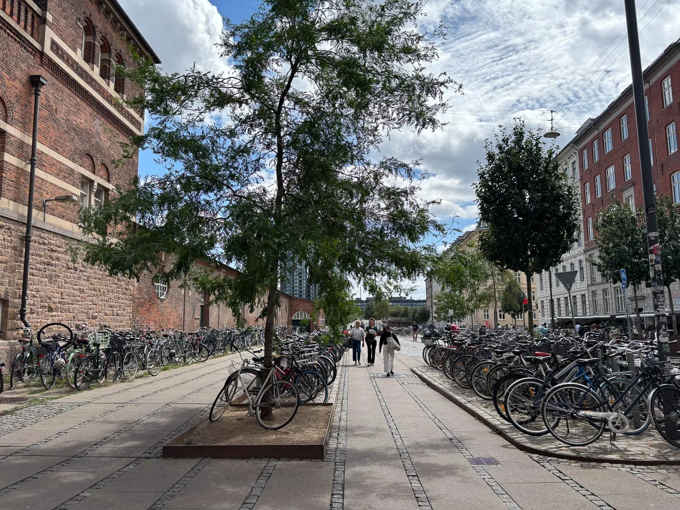
There’s a frequent tension between styles and eras that is both intriguing and aesthetically pleasing. Old brick, new round windows. Two historic buildings flanking a modern angular facade.
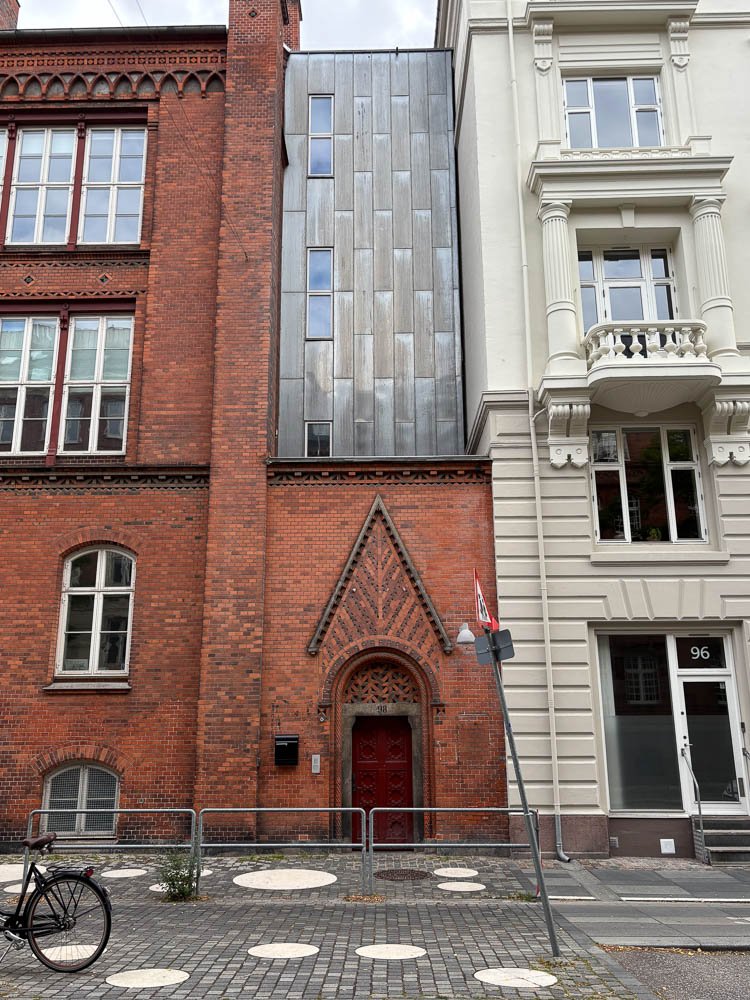
Circles in the sidewalk!
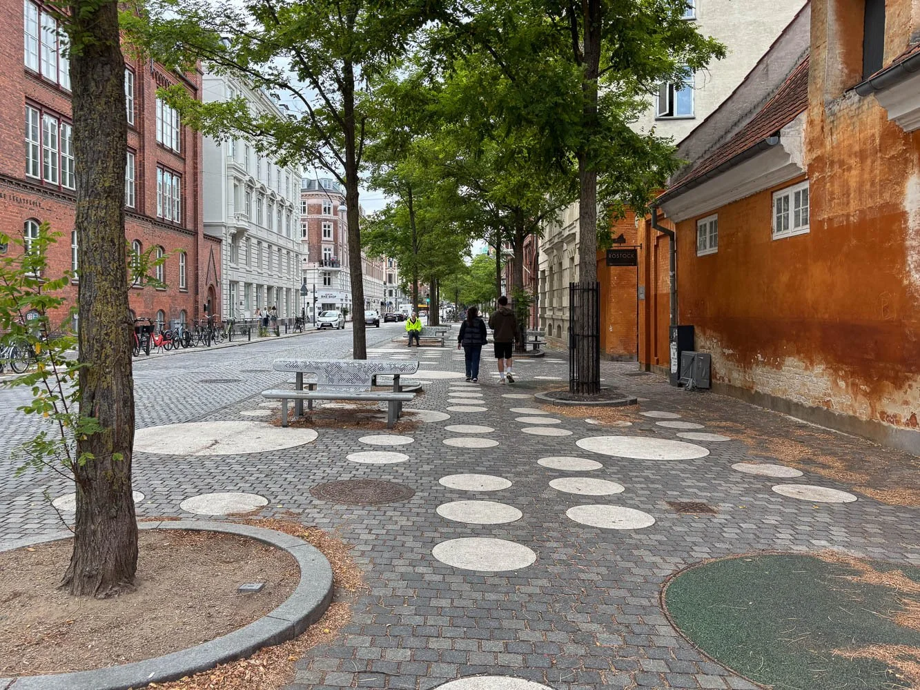
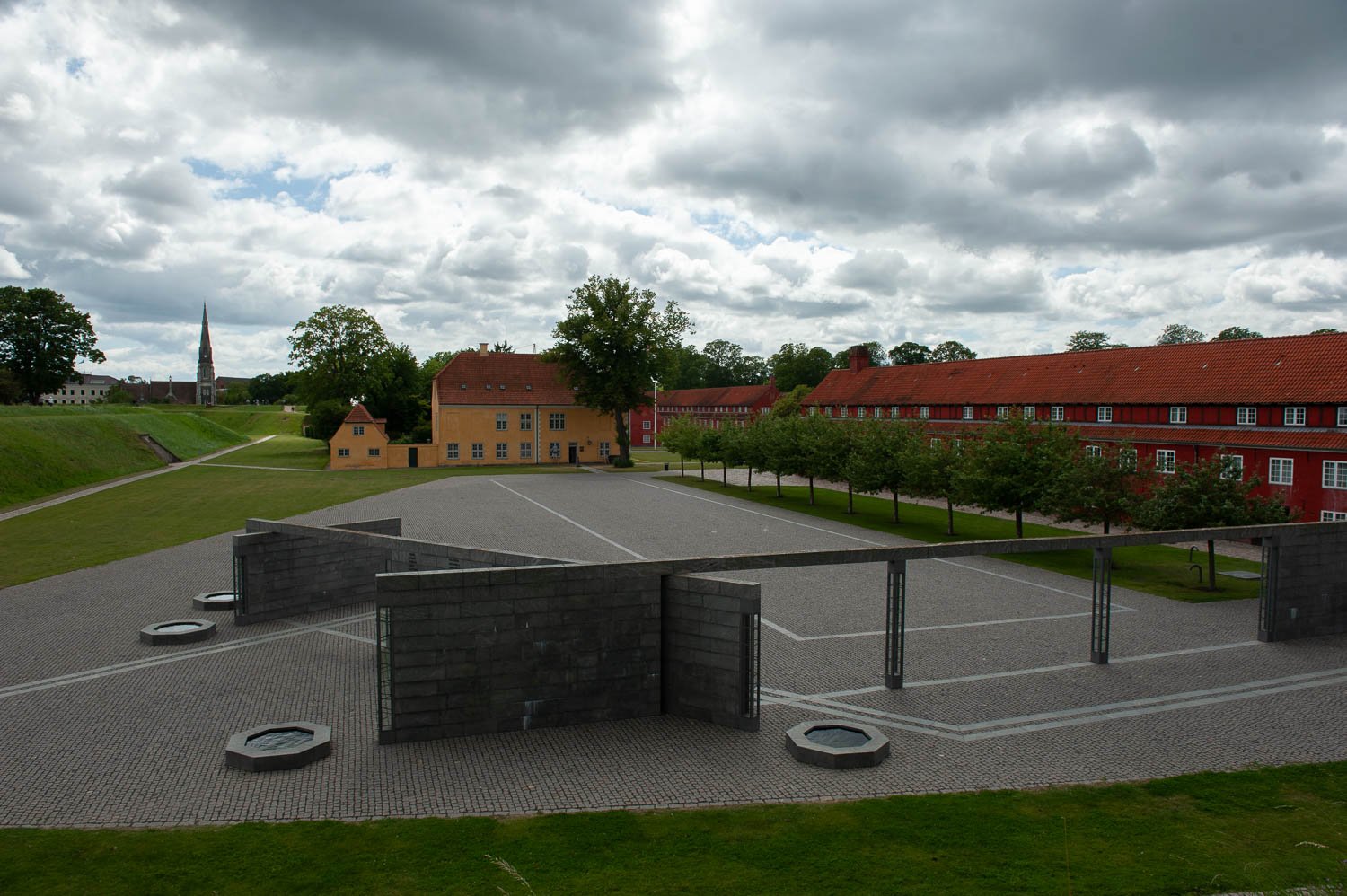
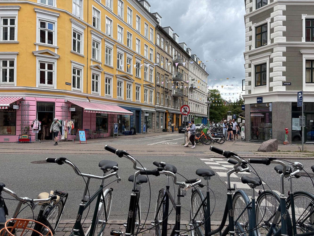
I loved the clean stark lines of this courtyard against the quaint old character of the yellow and red buildings.
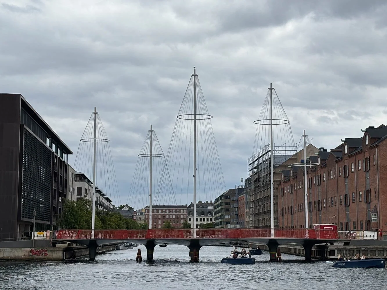
Sadly the Circle Bridge was closed while we were there, but it was still so fun to see it in person. Its clean modern lines contrast so nicely with the historic buildings all around it.
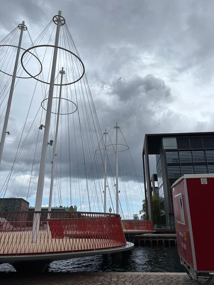
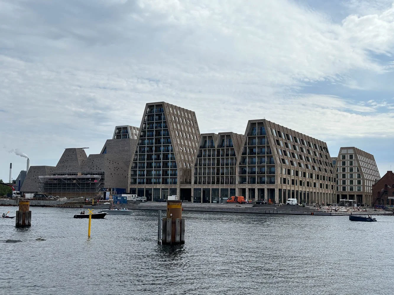
You don’t have to walk far to realize that Copenhagen is a city of architecture.
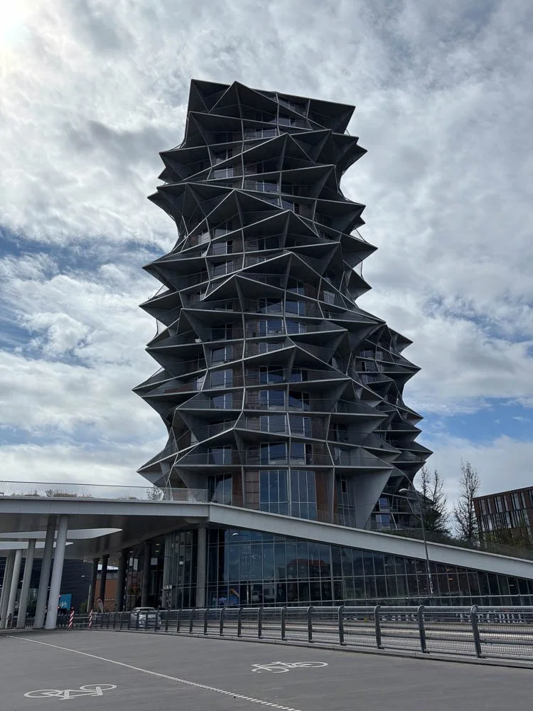
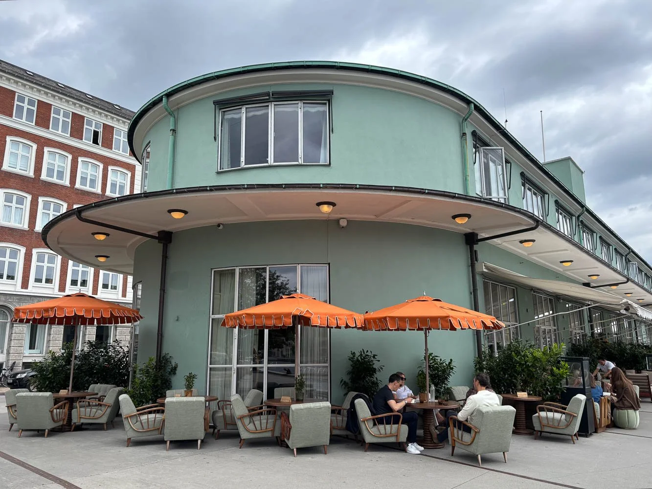
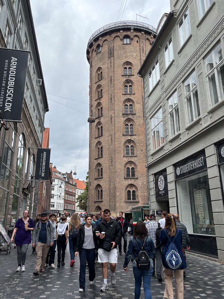
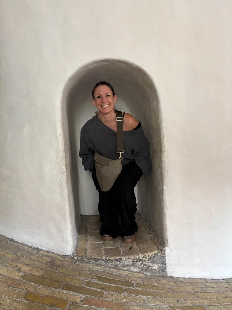
We braved the tourist areas a couple times to see some classics, including the view from the Round Tower, built in 1642.
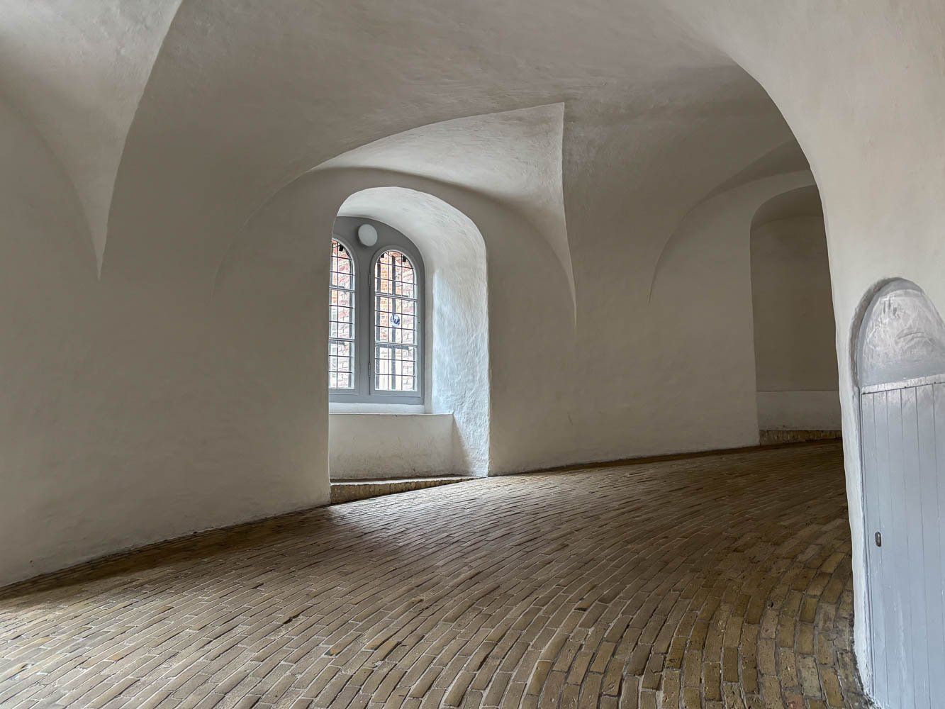
The rest we just took in as we walked around. I can still hear the whir of bicycles rushing past. I’ve never been in such a quiet city in all my life.
I took away two things from my visit to the Danish Architecture Center: 1) good design must be beautiful, functional, and sustainable, and 2) the Danes believe everyone deserves to live in beautiful spaces, even if they’re very small. And their architects set about very early on to make that happen.
I wish I could import and implement both those ideas immediately.
Alas, all I could cart home in my full suitcase was a few packs of really cute napkins and some superior bars of chocolate.